

I Built a Responsive System With One Model Change
This is why my Flutter project now has 99% responsive accuracy

As I’m building TestSweets one question I got asked a lot is, is it responsive?
The answer is yes, but it wasn’t 100% accurate.
My responsive solution before the change
Let me give you some context, when using my software, you start by placing on screen what I call automation points.
These are points that you can interact with through my Flutter Desktop app and write automated tests.
This means that a point placed at (100,100) on a device that is 500x1000 pixels, should not be at (100,100) on a device that is 750x1500, logically it’s not in the “same position”.
Here’s a graphic to illustrate:

What it should actually look like is this:

This is logically at the correct position, and the math to get there is quite simple.
You calculate the size of the adjustment you have to make using: targetScreenSize / originalCapturedScreenSize
And then you multiply the positions with that ratio. So as an example, we take the width of the target screen size, 750 and divide by the width of the original screen size, 500 and we get 1.5.
We multiply 100 * 1.5 and we get 150, so that’s the new x position.
This makes logical sense, but there was a major flaw.
Why My Solution Was Failing
Even though my thinking and my solution make sense, that’s not how we build mobile apps. It’s not an exact 1-to-1 scaling when we increase UI to match a new size.
We often use specific font sizing depending on the screen size bucket.
We often use different padding horizontal or vertical depending on how the UI looks.
We sometimes completely change the layout of a UI if it’s too small/big
This meant that often the positioning of the automation points was not accurate on devices of a different size. Here’s an example of me capturing the automation point on the left, and then running it on a larger device.

My goal was to fix this, but also solve all the other responsive feedback I got as well.
How do I place points for different layouts on different form factors?
How do I place points for different orientations?
And I solved all of that with a single model change.
The One Change That Solved Responsiveness
The model that I use to store interaction data is pretty simple. The most important property, relating to this feature, is the position property, which is of type WidgetPosition.
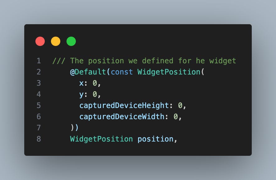
The WidgetPosition model stores all the data needed for us to place the automation point in the correct place.

To implement the most accurate responsive sizing that I possibly could, all I needed to do was change the position property in the Interaction model into a list of positions.
How did that solve the problem?
Since the screen size, and orientation is also stored in the WidgetPosition model, it means I can store a position, for every screen size and every orientation per screen size.
Simply by turning the position into a list of positions.
This required me to make a bunch of other, more boring changes, in the code to accommodate the change, but essentially made this the most accurate responsive UI system I’ve ever built.
It means that if you see an interaction point not in the place you want it to be, you can simply long-tap on it, drag it into the position you want, and it will always show in that position for that screen size.
How did I get to this solution?
It actually took me a while, I first went down a different path, and implemented that solution, and as I was nearing the end of the implementation I realized I didn’t need a new model and could just use the solution I explained above.
I found it 2 days after implementing it in a much more difficult way.
It took some time to find, but once I found it, I deleted a bunch of code and got some awesome new unit tests out of the refactor as well.
That’s it for this week.
If you’d like to work with me, read on below.
If you’re working for a company using Flutter, making more than $3m per year. I’d like to work with you to improve your quality assurance process.
I have an enterprise offering for TestSweets. The FilledStacks team will convert all your existing test cases into automated test sweets, with 0 involvement from your developers so you can focus on building new features.
If you’re interested, reply to this email or email me at automation@filledstacks.com
Any Udemy courses on master of responsiveness?